Sensor Data Filter And Personalization Options
Filter and Personalization Options
The Filters section, located at the top of the page, allows users to customize and refine the data displayed. It consists of two main rows:
Top Row Filters:
- Date: Sets the starting date for the data you wish to view
- Export to Date: Defines the end date for the data range
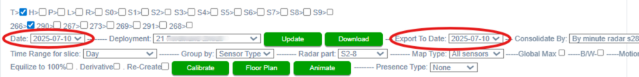
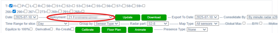
- Deployment: Select the intended beneficiary from the dropdown to filter by deployment
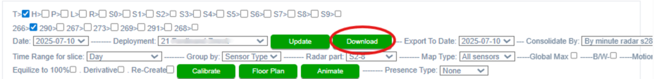
- Download: Click the green Download button to export the displayed data as a .csv file
- Consolidate By: Choose how radar data is grouped over time using the dropdown:
- By minute radar s28
- By minute radar detailed
- By 10 seconds radar detected
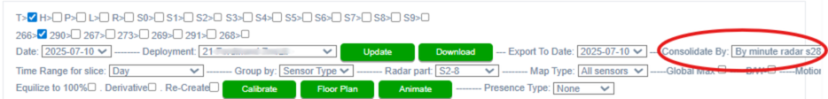
Second Row Filters:
- Group By: Organize bars from top to bottom by either:
- Device #
- Sensor Type
- Map Type: Choose the data view mode:

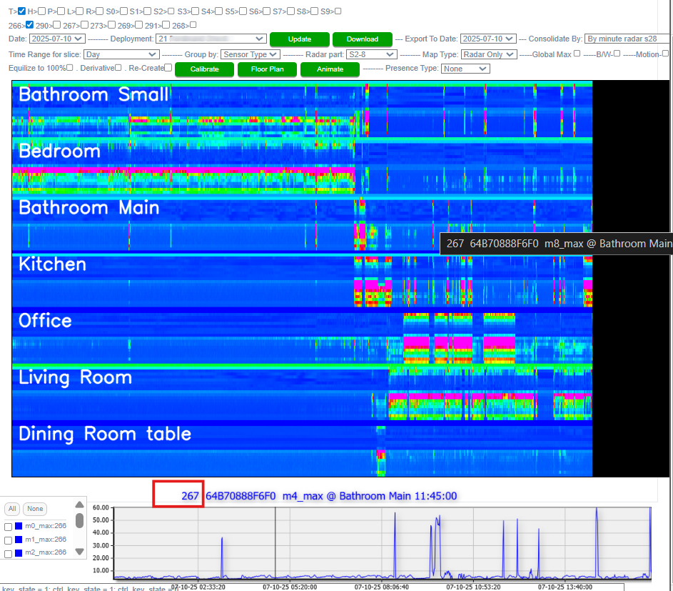
- Radar Only
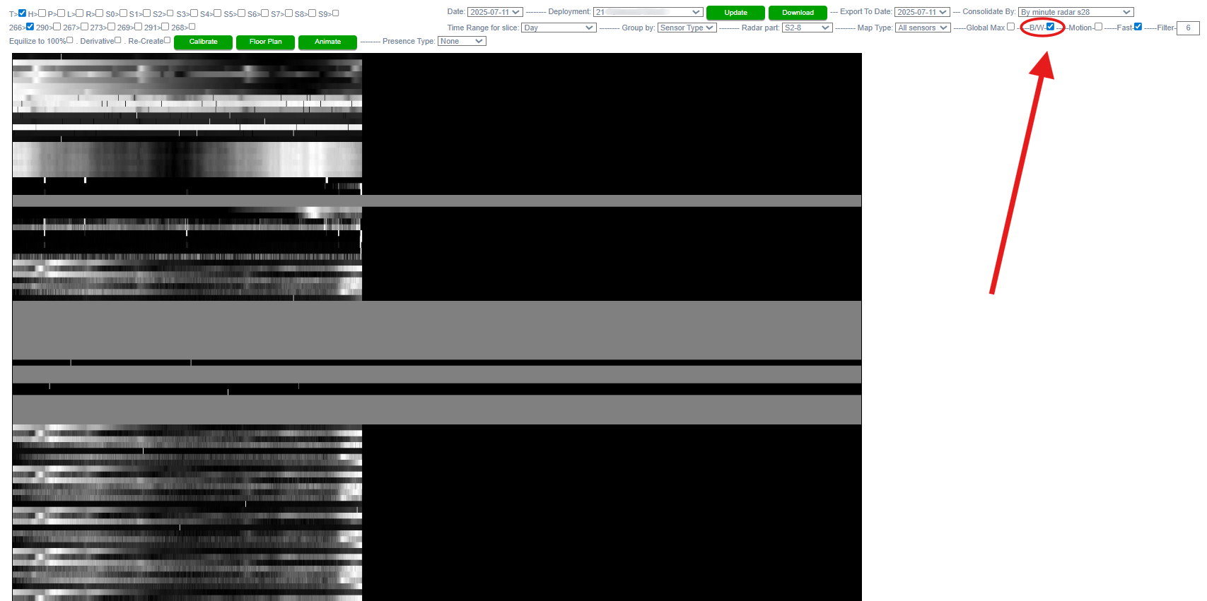
The Radar Only graph visualizes data from the radar component of each sensor. For better readability, the corresponding line graphs are grouped by room.
To identify a specific line and determine which radar measurement (M or S) it represents, simply hover your mouse over the line. A black tooltip will appear showing the measurement name. The black section to the right of each line graph indicates time periods for which data has not yet been recorded for the current day.
Each sensor measures motion and stationary presence within a room:
- Motion (M):
- Labeled as M0 through M7, each represents a detection range at 0.7-meter intervals from the sensor. For example, M0 is the closest (0–0.7m), while M7 is the farthest.
- M08 represents the aggregate motion, summarizing activity across all ranges.
- Stationary Presence (S):
To analyze any specific measurement in more detail, you can Ctrl + left-click on the corresponding line to generate a focused line graph in the section below.
- Locations
For more detailed guidance on configuring and interpreting room layouts, please refer to the “Utilizing the Floor Plan” section of this manual. The color-coded representation of rooms in that section directly corresponds to the Locations view.
In this mode, users can visualize the location of a beneficiary at any point throughout a given day. Each color in the horizontal bar represents a different room or area, making it easy to track movement and presence over time. To determine which color maps to which room, refer to the left-hand menu in the Floor Plan section.
- The black section at the right end of the bar indicates time periods that have not yet been measured for the current day.
- To view the precise time in military format, hover your cursor over a specific point on the bar.
- To change the date being analyzed, use the Date dropdown menu located in the filter section above the graph.
This visualization helps provide a clear, time-based overview of location-based activity within the monitored space.

- All Sensors
This is the default display mode, presenting all available sensors within a selected deployment along with their associated components.
- Note that blue section at the right end of the bar indicates data that has not been measured in the current day.
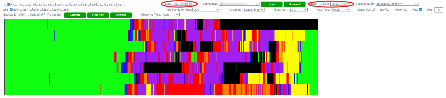
- History
The History view allows users to visualize location-based sensor activity over an extended period (spanning multiple days). In this mode, location bars for each day within the selected date range are stacked vertically—where the topmost bars represent the most recent date.
To define the date range:
- Use the Date and Export to Date fields located in the filter menu above.
As with other views, hovering over any point on the visual display reveals detailed information, including the specific time of day.
- All Locations
This feature is not functional at this time.
- Update: After selecting your desired filters and settings, click the green Update button to refresh the data below

- B/W (Black & White) Mode: Enable this option by checking the box to convert all color graphs to grayscale